 |
| Hooray! |
 |
| Boo! |
In the original post, which forms part of our A to Z of Aberdeen we asked rhetorically:
"We’re not sure whether this system is unique, but it’s certainly unusual and is [has been?] of very high quality."Thanks to old friend 'AJD' for pointing out that the signs are not unique:
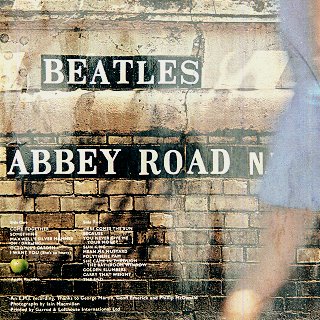
Thanks are also due to fellow Aberdeen Blogger RXPELL of the Moved to comment blog for pointing out that the Aberdeen City Centre Development Framework (huge slow pdf) makes capital out of the tiled signs, and looks to use them as a way of distinguishing Aberdeen from it's "competitors".
Signage and way-finding in the City Centre should capitalise on existing unique features, such as the distinctive street letter tiles used to name streets in the City. These individual fired clay tiles with white lettering on a black background do not occur elsewhere in Scotland and could form the basis of a unique signage strategy distinguishing Aberdeen from its competitors.
[our emphasis]We're concerned about that use of the words 'should' and 'could'. These are "weasel words" which renders the quoted policy meaningless as a statement of intent. Disappointing.
CODA
We've also found these couple of outliers which have been, um, sort-of "placeholder" repaired.
 |
| LODGF W^LK |
 |
| SHOF L^NE |
Interestingly, on both examples the "E" has been replaced with an "F" and the "A" has been replaced with an inverted "V".
No comments:
Post a Comment